COVER DESIGN: Image is Everything
1September 20, 2013 by Mod
Is there such a thing as a perfect cover image? Many indie writers think so. They squee and do happy dances when we find that just right image. And they don’t take the search for the right image lightly either – sometimes days goes by, weeks even before we find it.
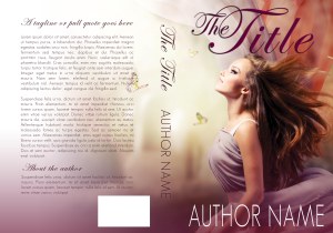
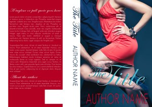
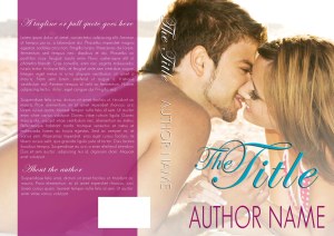
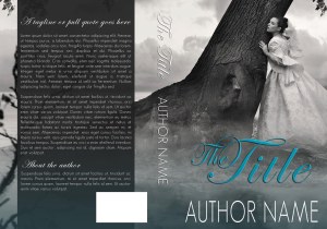
And this is good. Cover images say so much. While quite a lot can be expressed with lettering and colors, ultimately the image speaks the loudest on most covers. Consider the below covers. All of them have almost identical title design, but how different are they in tone, genre, even plot?
This one, for example, feels like it might be fantasy romance:
This one is straight up contemporary romance, maybe about dancing, with humor and possibly pretty steamy:
This one is a light-hearted beachy summer romance, maybe a little sweeter than steamy:
And this is historical, gothic even, possibly paranormal. You can image the same cover in color might evoke something quite different:
What kinds of images work for YOUR covers? What is your genre, your tone, your intended audience? Finding the right image will answer all these questions and more.


That’s beautiful! I wish I had a story to go with it. Alas, I do not. 😦 Beautiful work though!